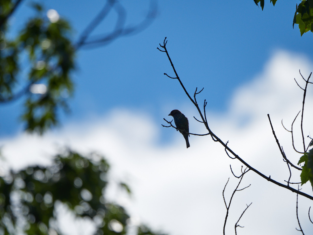
52 Frames (May 2022)
✍️ • 🕑 May 2022 • Series: 52 Frames • Tags: abstract photography • black and white photography
Since January of 2021, I’ve been doing these weekly photographic challenges over at 52 Frames. The month of May has not been my strongest; a couple of my entries were half-hearted, due to illness or prioritization of other things. Nevertheless, I am pleased to continue my streak for another month and to unpack the results.
After all, there were five Sundays in May, and therefore five challenges. They can’t all be that bad. Can they?!
17. Leading Lines
I was under the weather, so I didn’t feel like going outside to take a better photograph than this one. This is underneath the 7 Train in Jackson Heights, in one of my favorite neighborhoods in New York City. Lots of tamales for sale nearby.
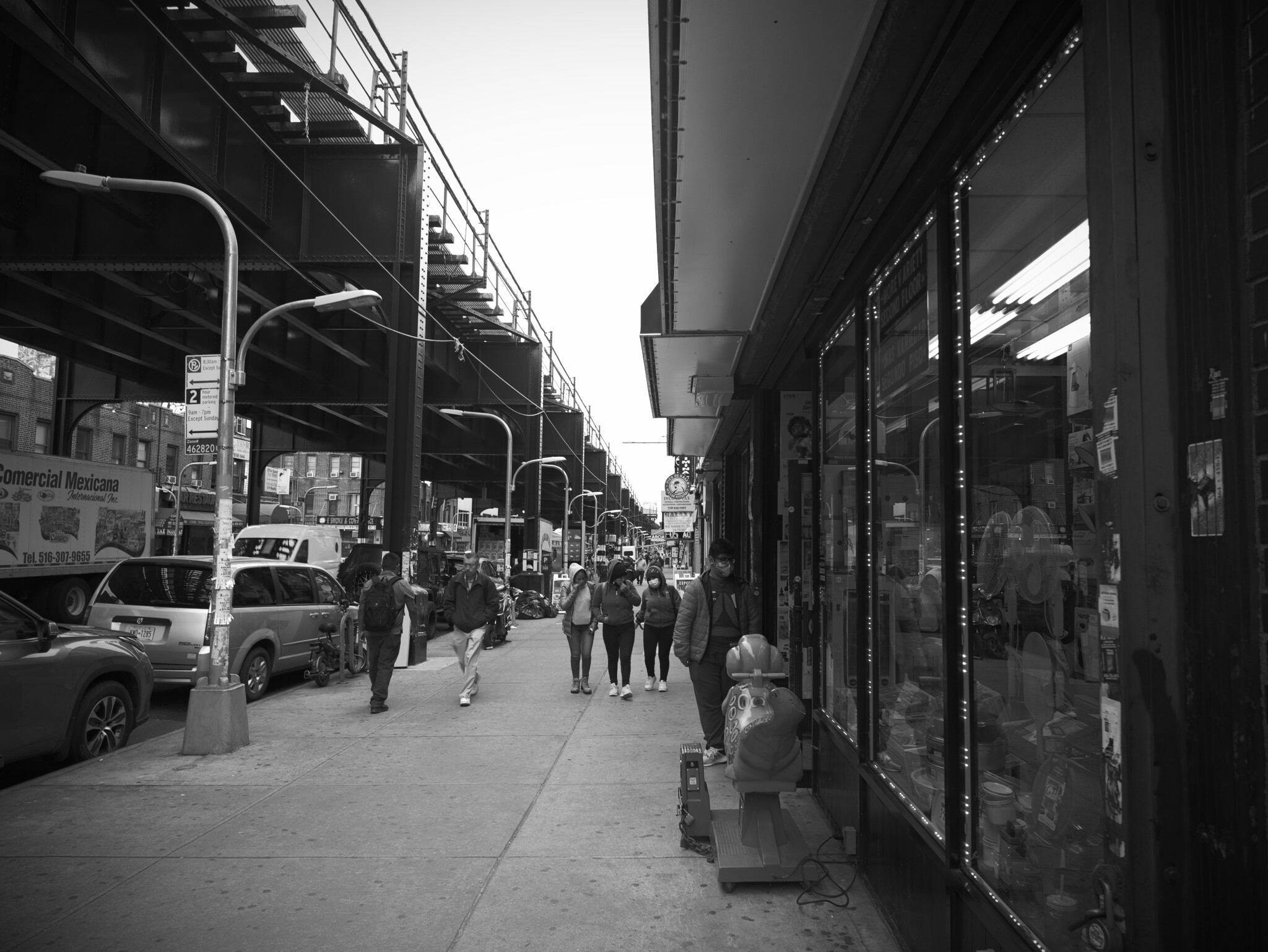
I don’t think I nailed the edit, and I don’t think this is a great photograph, but I will say, at least it has a lot of leading lines.
18. Flat Lay
Still under the weather; threw this together last minute. Not particularly good or compelling.
“Flat Lay” photography should be a nice top-down look at some well-lit objects.
This is a cluttered desk.
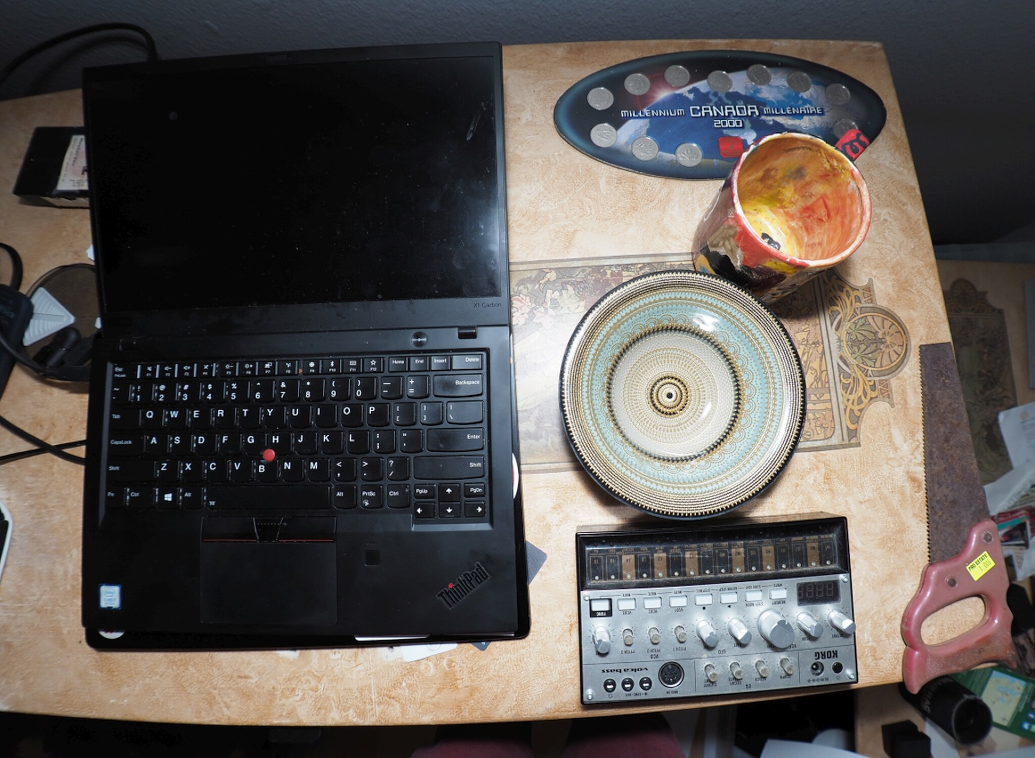
And yes, I put many of those objects there because I thought they were interesting, but they really have no relationship with one another. The angles are off, the framing is poor, there’s some noticable distortion that keeps things from actually being “flat.”
There are things that probably would have worked – I considered a dramatic arrangement of my coffee mugs.
But, I went for a nice long walk to Volunteer Park and up and down the hill instead.
19. Architecture
This is a local Parochial school. The dome at the top always catches my eye!
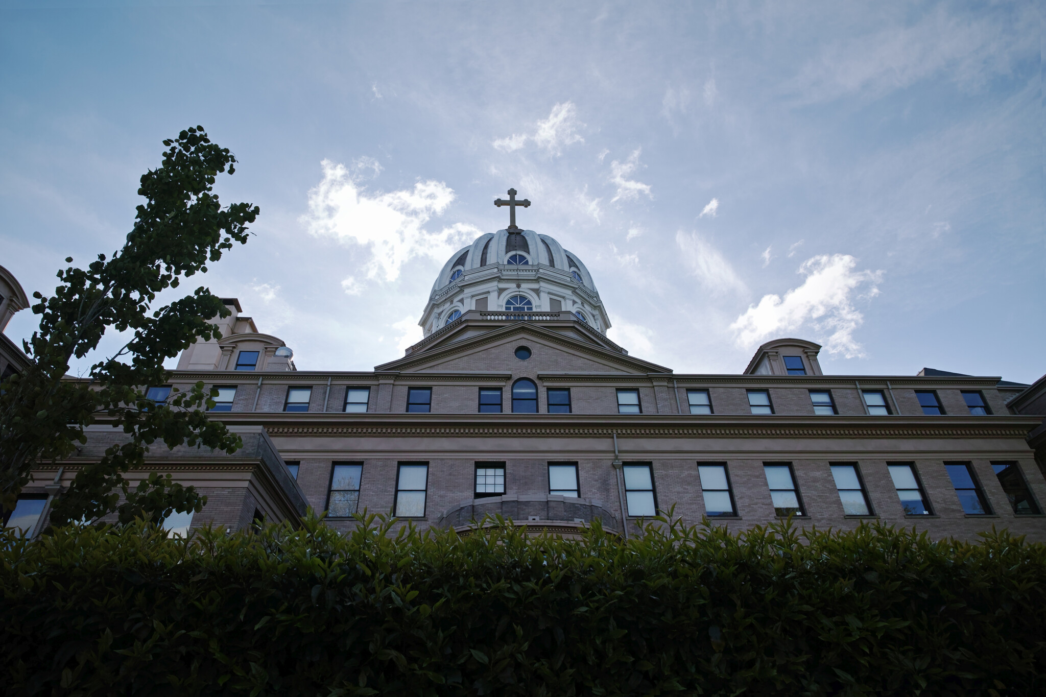
I feel like including the dark, shadowy bushes in the foreground adds some drama to the scene (and hides the school busses.) I also feel like the sunlight is a bit too bright, and the colors a bit washed out.
Oh well, at least I have resumed trying.
20. Abstract
There’s a sort of movement in photography (no pun intended) called “intentional camera movement” in which one deliberately moves the camera with a slow shutter speed to get blurry results.
I’m somewhat of a naturalist when it comes to photography, preferring to leave things closer to how they appered to me at the time than trying to impose a strict vision onto the world. I’m also not a big fan of camera shake, which is why I’m so fond of using Micro Four Thirds cameras with phenomenal stabilization.
Nevertheless, I thought it would be worth combining this technique with my own enjoyment of low-light/night photography.
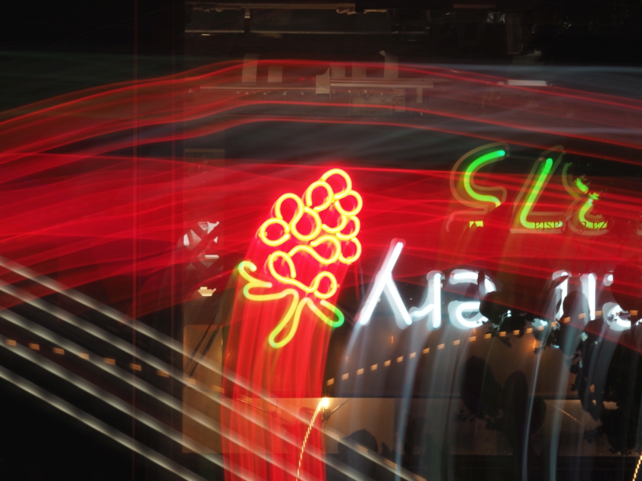
The result is this image, initially of a neon sign displaying grapes in a pizza shop / Italian restaurant window.
By holding the shutter open and keeping the camera steady for part of the exposure, particularly of a bright light like a neon sign, and moving the camera later, I found that I could easily combine blurry light trails with a discernable base image.
Kinda fun.
Might have to try it out more, come next winter.
21. Inspired by a Photographer
Alright, readers. This was my chance to take a stab at aping another photographer.
My choice was probably not the top of anyone’s list: Benjamin Baltzly, a photographer born in 1835 in Ohio, and who at various points worked in his own photography studio. In 1871, though, he was employed as a photographer by the Canadian Geological Survey on a trip through British Columbia, where he took a lot of lovely vertical panoramas with white matted frames.
I had the pleasure of seeing a few on display at the museum in Kamloops. (Here’s their info on their collection of his photos.)
Since I am currently travelling, I don’t have the liberty to really play around with aping the “large format” look. But, here’s a stab at an emulation.
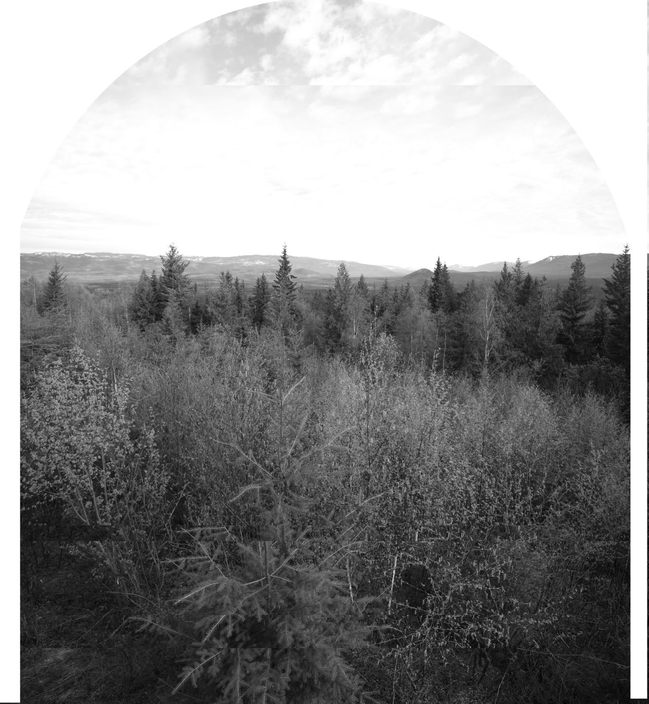
This is a quick & dirty edit – the seams are showing, and I make only half-hearted apologies.
This was taken with a tripod from the Green Mountain Lookout Tour in Wells Gray Provincial Park, fittingly enough in British Columbia.
Manual focus, manual mode, monochrome, red filter. Mostly three photographs, straight out of camera B&W jpegs + poor stitching & the like in GIMP.
Compositionally, I think it’s a bit of a whiff. Too much boring foreground with bland vegetation, mountains too small in the distance, sky not interesting until it’s right against our rounded matte.
But, I still like looking at it, and that’s what counts, right?
This post was part of a series:
Thanks for reading!
If you enjoyed this post, you might enjoy these 5 similar posts:
- 2022-02-28 —52 Frames (February 2022)
- 2022-07-31 —52 Frames (July 2022)
- 2022-06-28 —52 Frames (June 2022)
- 2022-09-26 —52 Frames (September 2022)
- 2021-12-31 —52 Frames (December 2021)
