52 Frames (June 2022)
✍️ • 🕑 June 2022 • Series: 52 Frames • Tags: cellphone photography
Okay, readers. You know the drill by now. (Maybe?)
One photo a week with a challenge. The more effort put in, the more I learn and get out of doing this whole thing.
Well, guess what? I was traveling somewhere every single week in June. And I kept forgetting to go through my camera and actually pick the photos I thought I’d use when I had internet.
So eventually, I gave up, said screw it, and shot every single one of these with a cellphone.
Are they any good at all?
Well, I’d be lying if I said that they weren’t any good, but I dunno that they’re very good. So, let’s unpack.
22. Everything In Focus
When you’re taking a photograph, it’s important to be mindful of what is in focus, and what is out of focus. The amount of “blurry stuff” vs. “non-blurry stuff” is a function of a few things: distance to the subject (very close/far objects can introduce more blur), the focal length of the lens (more zoomed in = more blur), the aperture of the lens (more open = more blur), or the size of the circle of light cast by the lens (larger = more blur).
The upside of this, of course, is that cellphones (and older point-and-shoot digital cameras) have teeny-weeny lenses, so mostly everything is in focus. Couple that with my use of the “wide angle” on my phone, and boom, ’nary anything out of focus. Ta-da!
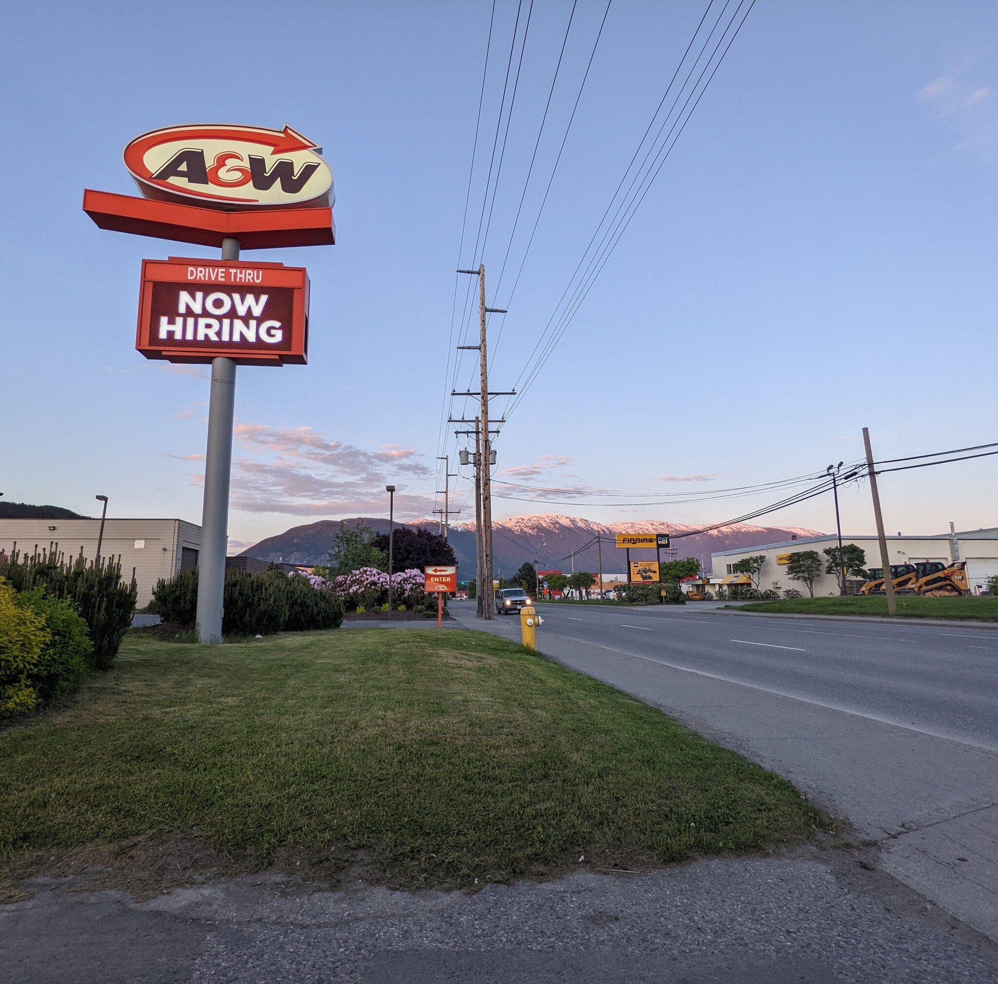
So, what’s going on here?
I’m at the A&W in Terrace, B.C. because pretty much every other option closed at 6PM. It’s actually quite, quite late for June.
The colors of the sky (which I rather like) are beginning to fade to sunset.
The problem with this composition is staring me straight in the face. It is simply not well-composed, probably because I took it out of a car window or something. The highway in the foreground could serve as a leading line, bringing the viewer’s eyes towards the beautiful Costal Mountains in the background. The A&W sign, then, is eye-catching, but not really contributing to this same movement. Combine the two, and unfortunately, I find that the longer I look at it, the more my eyes are drawn towards the unsightly telephone pole that is dead center in the frame.
But hey, the ugly telephone pole is in focus.
23. Triangular Composition
The goal here was to try to compose a photograph where the lines made a triangular shape together. Well, I got a lot of triangles in this one.
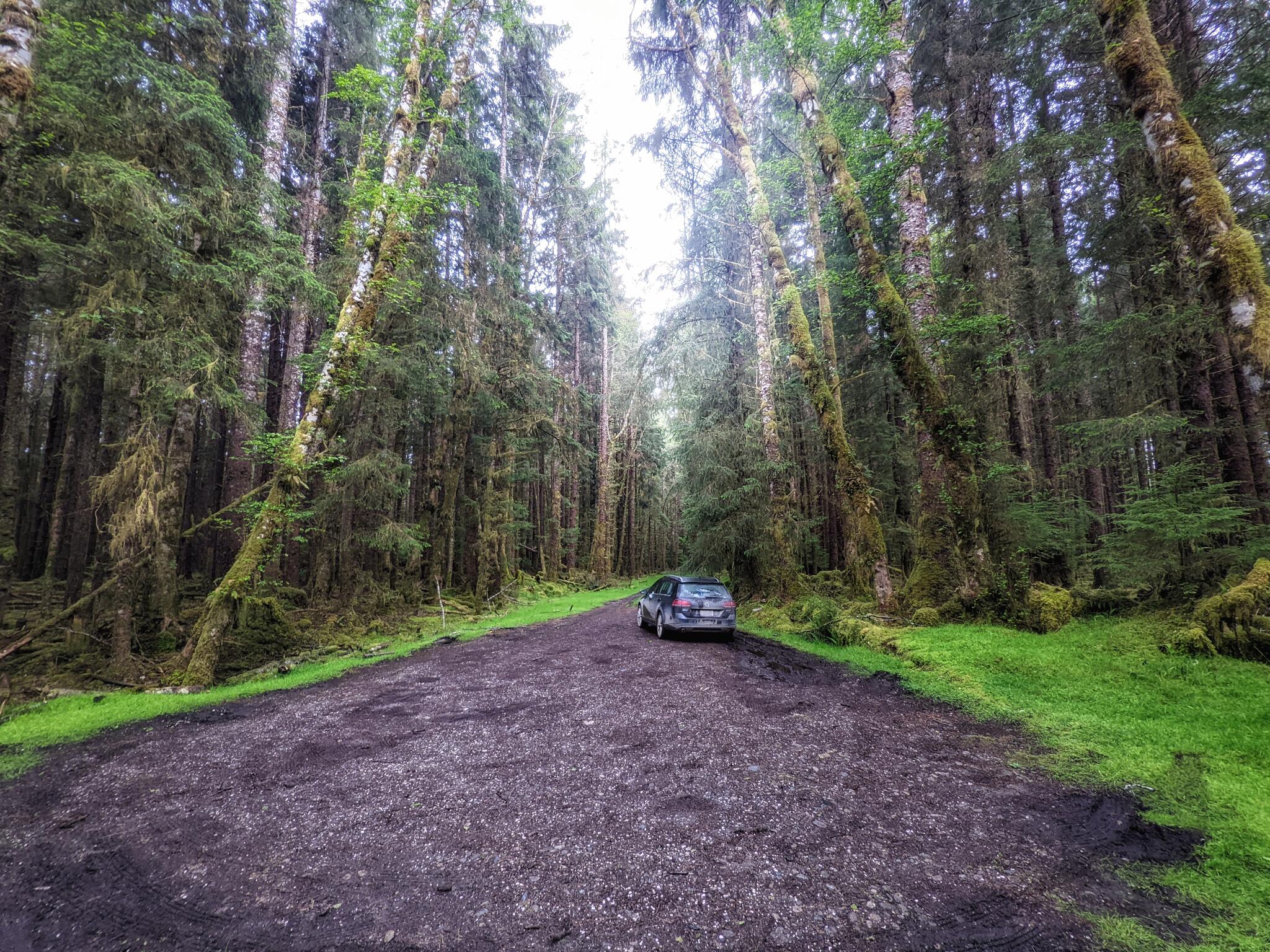
It’s a cellphone snap of where I parked, near the short trail to Secret Cove on Moresby Island. Again, I shot with the wide angle lens on my cellphone, which emphasized and elongated the lines, bringing in many potentially overlapping triangles in the trees.
I wouldn’t put it on my wall, but I don’t have all that much to critique on this one compared to the other cellphone snaps.
24. Shot From Above
Hmm… maybe I’m not actually the best at taking photos that are straight down at things. I think that’s what I sussed when I did some abysmal still life that I tried shooting from above, and I think I sussed that again today.
The location is Little Huson Caves, the subject, a stump with some nice shrooms.
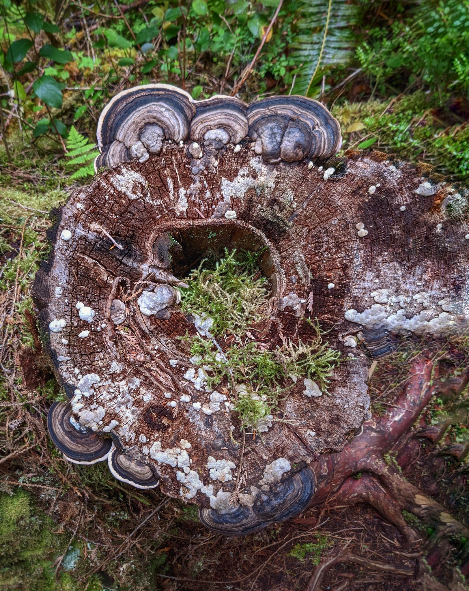
I went too overboard in the editing room on this one. The fact of the matter is, right adjacent to the stump was a wooden handrail, which I didn’t want in the image. I figured the clone tool in Snapseed could get rid of it, and it did, but certainly in a way that is immediately obvious and unseemly. Is the cure worse than the disease? Well, at least I’m trying new things.
If we ignore that part of the edit, the rest of it at least approaches my creative vision. Snapseed has a lot of tools, but I don’t think I can really take an image and edit it fully to my liking on it, which is unfortunate, because it would otherwise be a very fun app to use more often!
I did add some fake background blur to the outside of the stump. In general, I’m a fan of it, other than the edges where you can tell it is a cheesy effect. If it was done with more precision than I can get in Snapseed, it would be nicer. (I also kept the amount of blurriness and falloff area pretty low because I did not want that poor-edge-detection fake fake look.)
I think the image is still over-sharpened. (I’m not sure how to get images that aren’t over-sharpened from my phone.) But, the colors and contrast curves are roughly where I would want them.
So, like, you can see what my eye was drawn to, and I what I wanted to accomplish.
I blame handrails and apps.
25. What Is It?
I spent most of this week in Seattle, so I had the ability to reach for an actual camera. I just chose not to, in order to continue with the splendid cellphone theme. :)
So here’s the reflections of an array of lightbulbs in the brushed metal exterior of my electric kettle. Shadows cast by my hand and the phone somehow take on a shape reminicent of a mountain.
I edited this one in Snapseed too, and opted for black and white, because it just felt right.
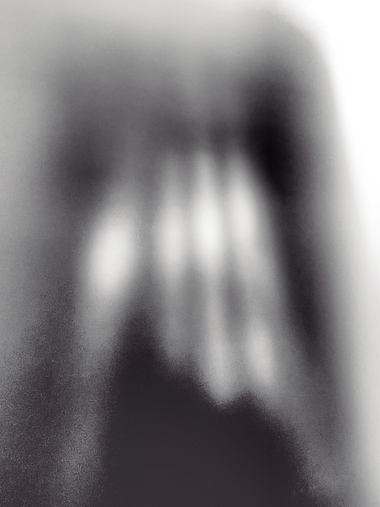
I find this one enjoyably abstract, if a little pointless.
This post was part of a series:
Thanks for reading!
If you enjoyed this post, you might enjoy these 5 similar posts:
- 2022-02-28 —52 Frames (February 2022)
- 2022-05-30 —52 Frames (May 2022)
- 2022-07-31 —52 Frames (July 2022)
- 2021-01-31 —52 Frames (January 2021)
- 2022-03-30 —52 Frames (March 2022)
